earth body
Earth Body is a space for body literacy, helping people better understand their bodies and cycles through research-backed education, classes, and resources.
The goal was to create a visual world that feels as thoughtful and grounded as the work behind it. Inspired by nature, organic forms, and the rhythms of the body, we developed a refreshed visual identity and website that balance structure with softness, bringing a more contemporary, intuitive, and human feel to the brand.


Visual Identity
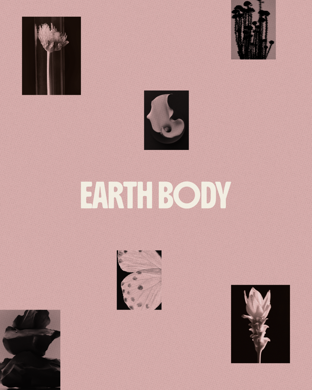
Earth Body’s refreshed visual identity is rooted in the rhythms of nature and the ever-changing relationship we have with our bodies. The goal was to create a brand world that feels grounded, organic, and human, while making body literacy feel more accessible and approachable. Inspired by natural forms, seasonal shifts, and the beauty of imperfection, the identity brings together expressive typography, earthy colors, organic imagery, and thoughtful details. The result is a cohesive visual system that balances structure with softness, designed to grow and evolve alongside the brand across its website, social media, and beyond.
Services
Brand Identity Refresh
Color Palette Development
Typography System
Visual Language
Website Design & Development
Social Media Templates
Brand Guidelines
01 logo design
Bold Form, Organic Feel
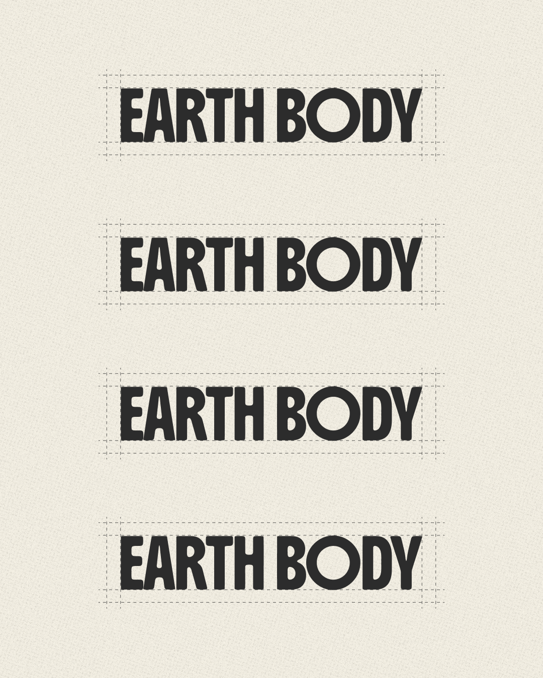
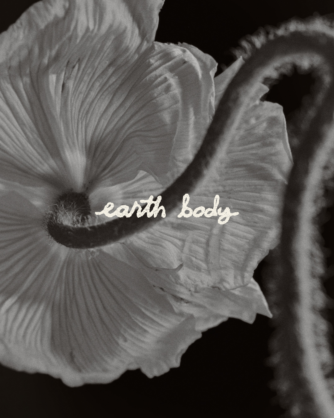
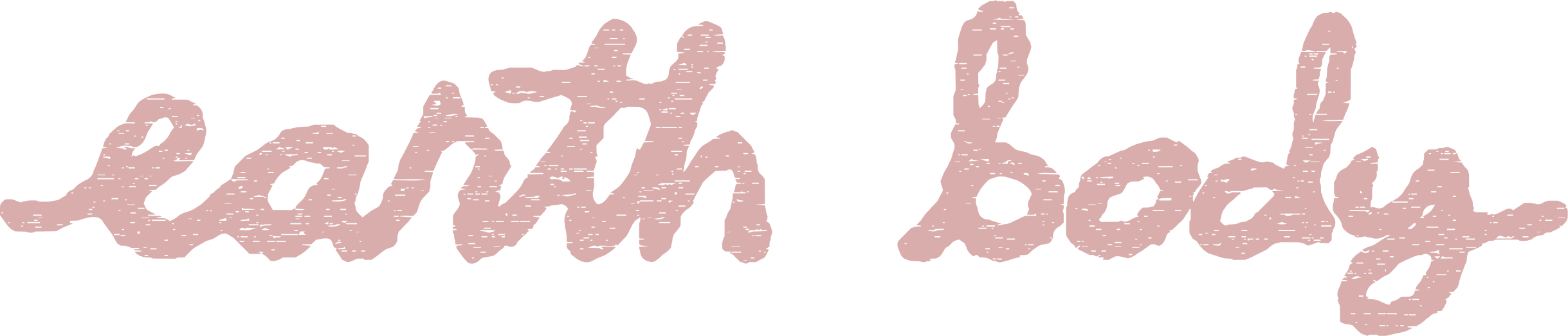
Earth Body’s wordmark brings together bold, expressive typography with a softer, more organic visual language. Its strong letterforms create a sense of confidence and clarity, while the handwritten secondary logo introduces a more personal, human touch. Designed to work across different backgrounds, imagery, and textures, the identity balances structure with spontaneity, reflecting the brand’s approach to body literacy: grounded in knowledge, yet fluid, evolving, and deeply personal.
02 Color palette
Colors in Season
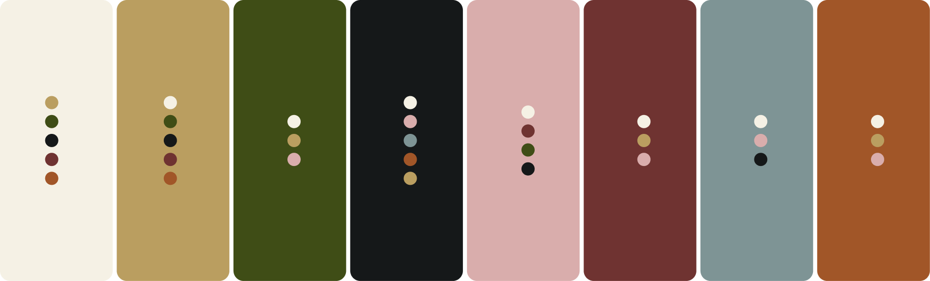
Earth Body’s color palette takes inspiration from the natural world and its ever-changing seasons. Soft creams and earthy greens create a grounded foundation, while warm ochres, muted pinks, deep burgundy, and terracotta bring warmth and depth. A dusty blue introduces a sense of calm and contrast. Together, the colors reflect the cyclical nature of the body, balancing softness with richness and creating a flexible visual language that feels organic, expressive, and alive.

Typography
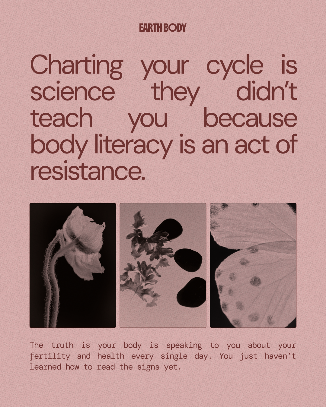
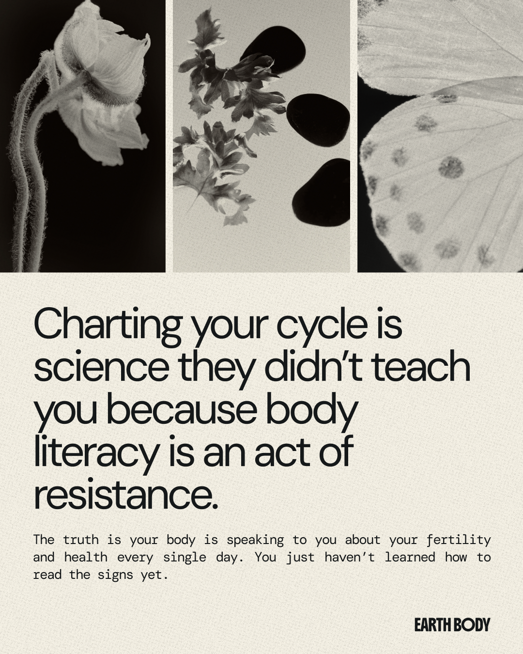
Earth Body’s typography balances clarity with expression, creating a visual language that feels both informative and human. Clean, contemporary sans-serif letterforms bring structure and readability to educational content, while bold headlines introduce confidence and personality.
Paired with smaller, understated text and thoughtful variations in scale and spacing, the typography creates a natural hierarchy that feels editorial without being overly formal. The result is a flexible system that makes complex information approachable while giving the brand a distinct, recognizable voice.
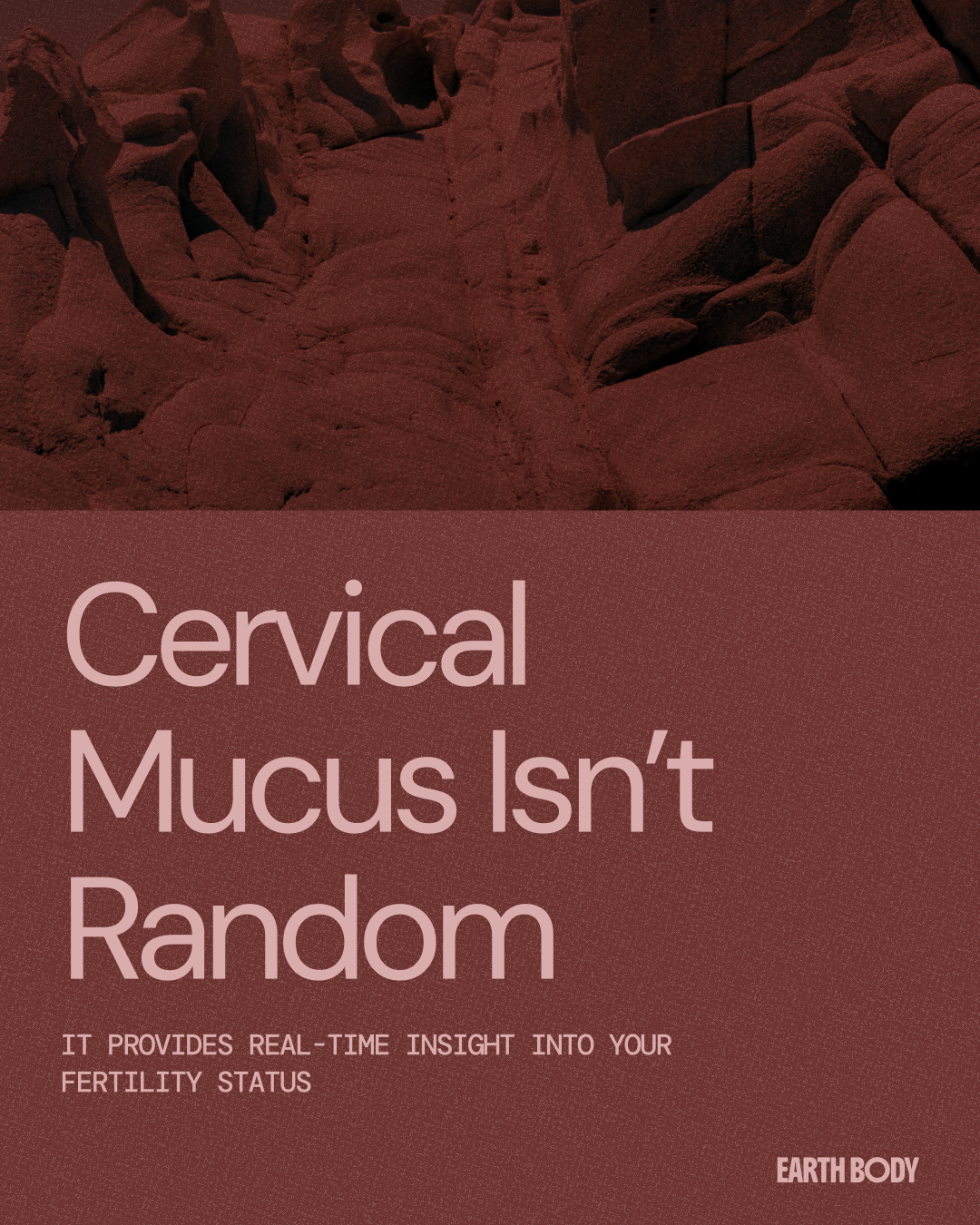
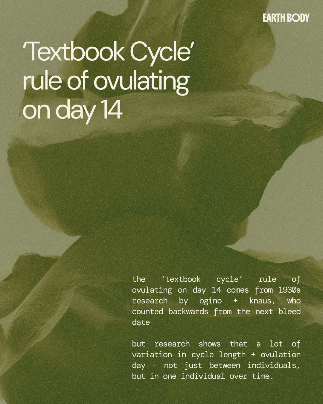
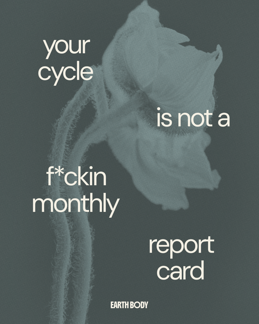
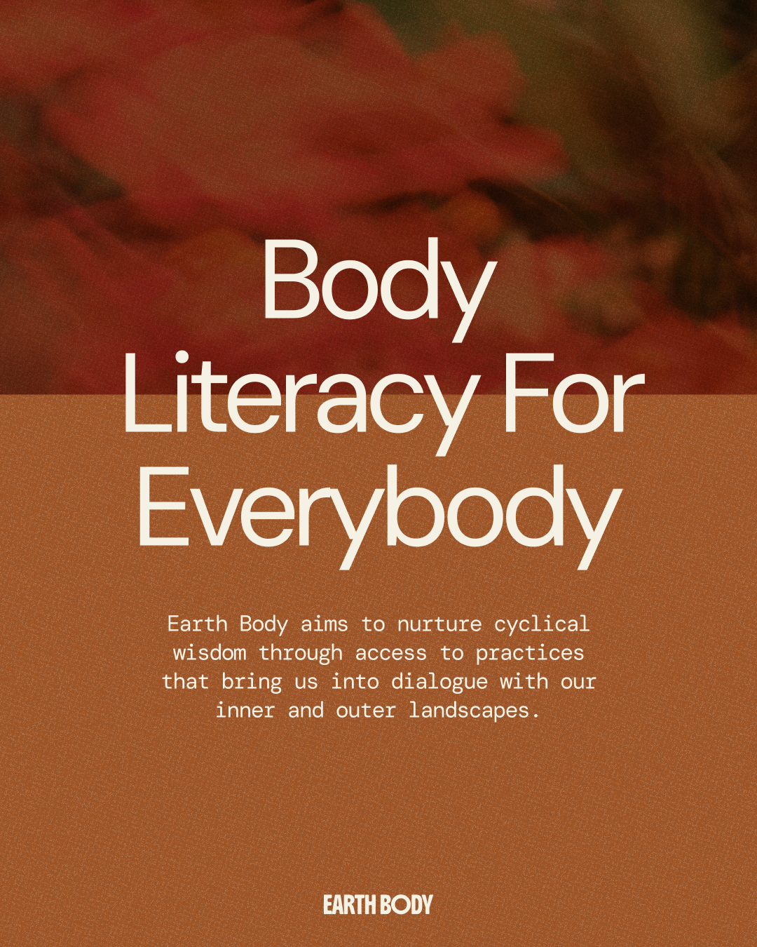
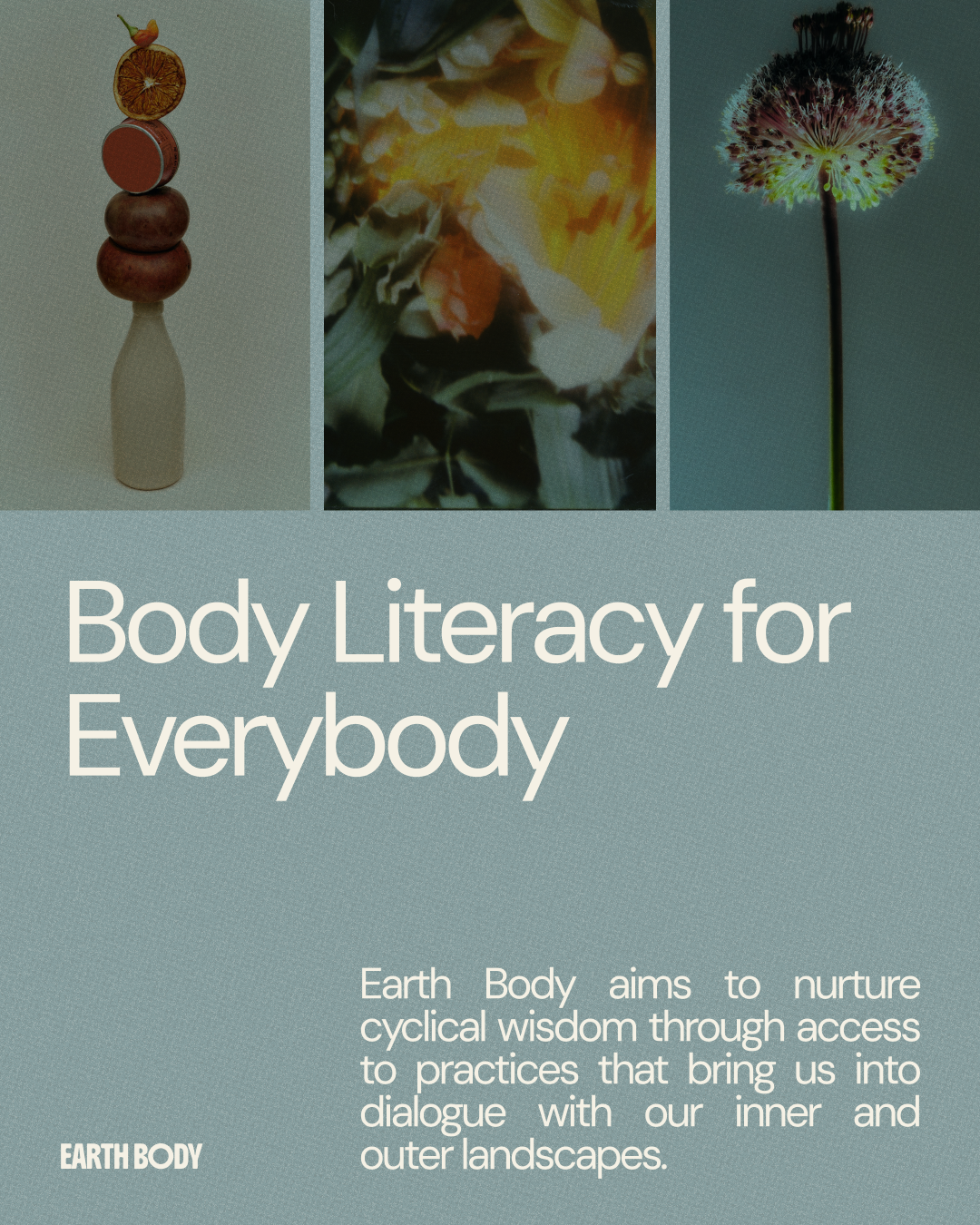
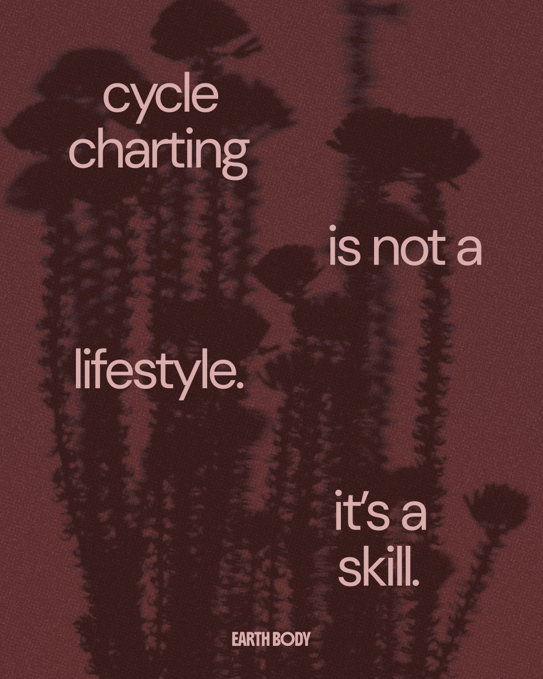
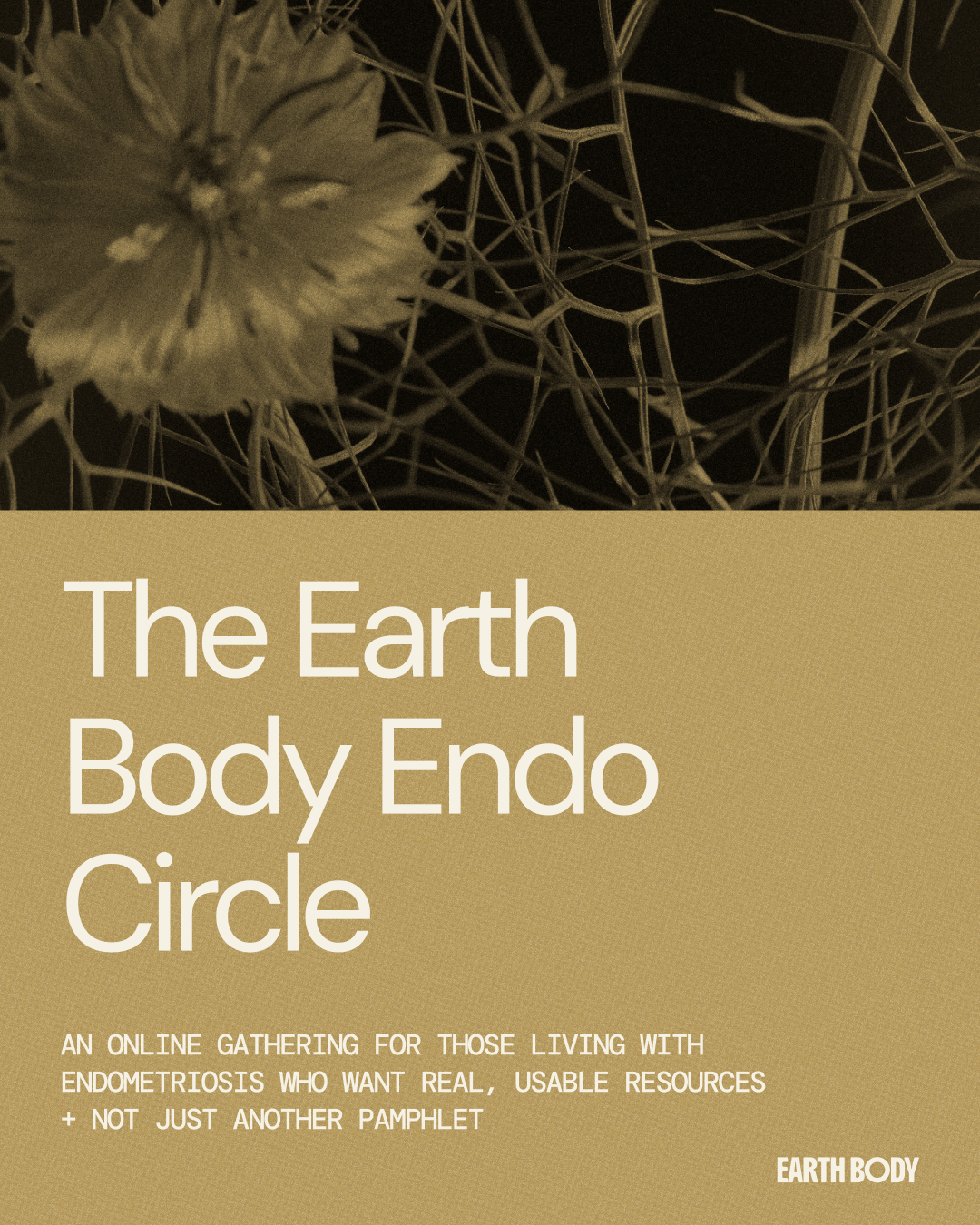
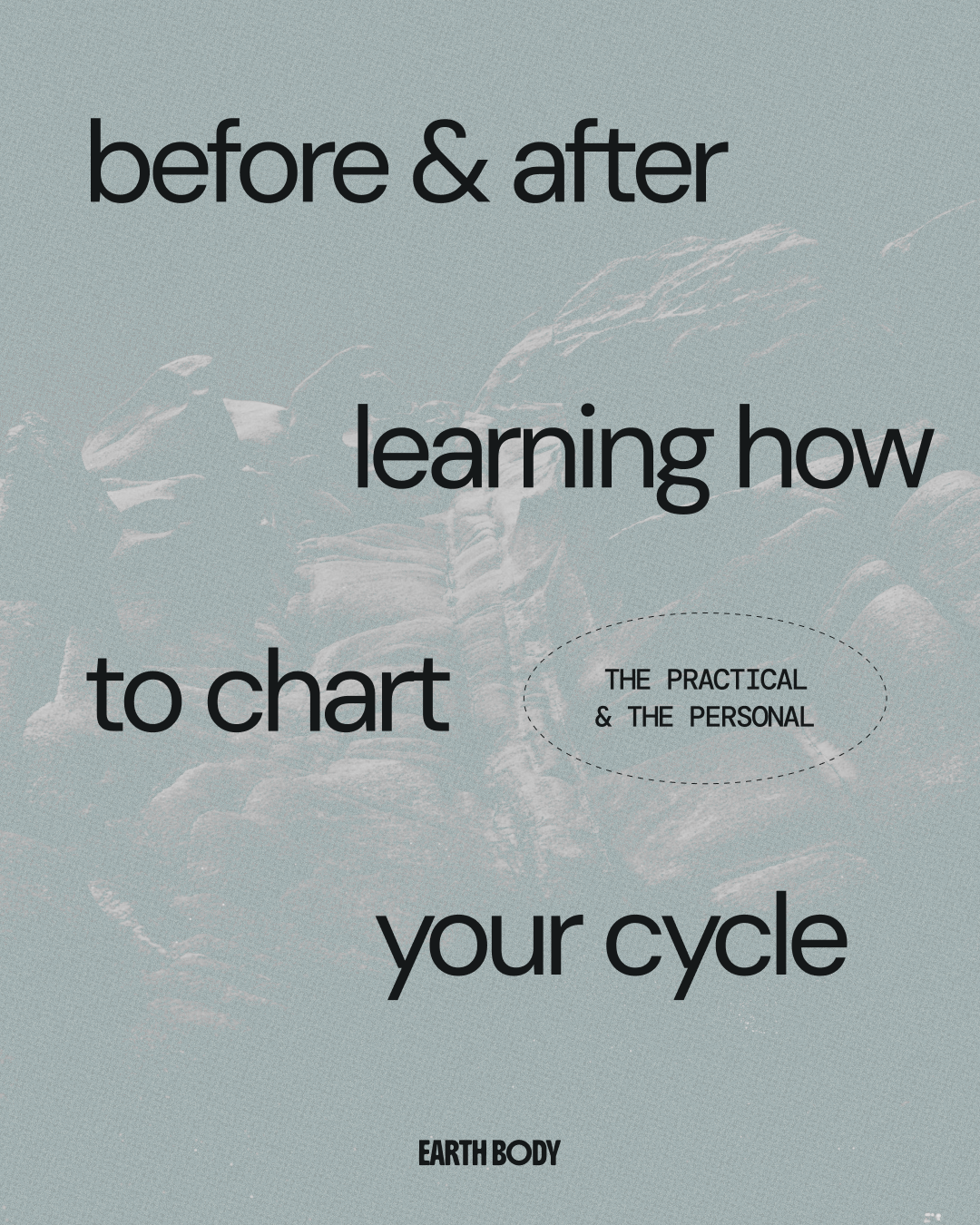
Social Media Templates
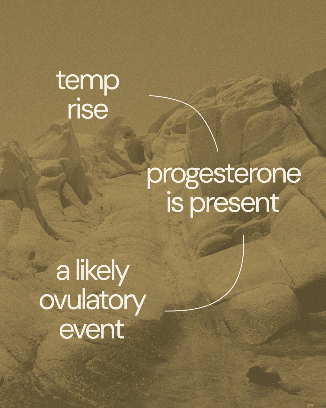
Earth Body’s social media templates were designed to bring consistency and flexibility to the brand’s everyday communication. Combining bold typography, organic imagery, and thoughtful layouts, the templates create space for both educational content and more expressive storytelling. Each design is adaptable across different content types, making it easy to share information while maintaining a cohesive visual identity. The result is a social media system that feels engaging, approachable, and distinctly Earth Body.