


Freda
Freda began as a playful experiment—an imagined brand brought to life through curiosity, collaboration, and design. What started as a name spotted abroad became a creative exercise in building a world from scratch, inviting people into the process along the way.
With Freda, we wanted to explore what it means to design a brand that feels both aspirational and approachable. We leaned into everyday rituals, textures, and moods to shape a story that’s equal parts dreamy and grounded.


Visual Identity
Freda’s new brand identity is all about finding beauty in the everyday. What began as a playful experiment grew into a fully realized brand world. One that feels warm, textured, and human. Rooted in story and mood, the identity blends elements like collage and grain with clean typography and thoughtful color choices. The result is a visual system that’s both strategic and expressive: flexible enough to live across digital platforms, yet distinctive enough to leave an impression. Freda’s identity doesn’t chase perfection, it invites you into a world that feels lived-in, intentional, and personal.
Services
Logo Design
Color Palette Development
Typography System
Visual Language
Social Media Template Suite
Brand Guidelines Document


01 logo design
Minimal Form, Human Feel
Freda’s wordmark was crafted to feel soft yet modern, with rounded letterforms that bring warmth and approachability. Its simplicity makes it versatile—equally at home on a clean background or layered over imagery and texture. The design reflects Freda’s lived-in, human quality while remaining adaptable enough to grow with the brand.

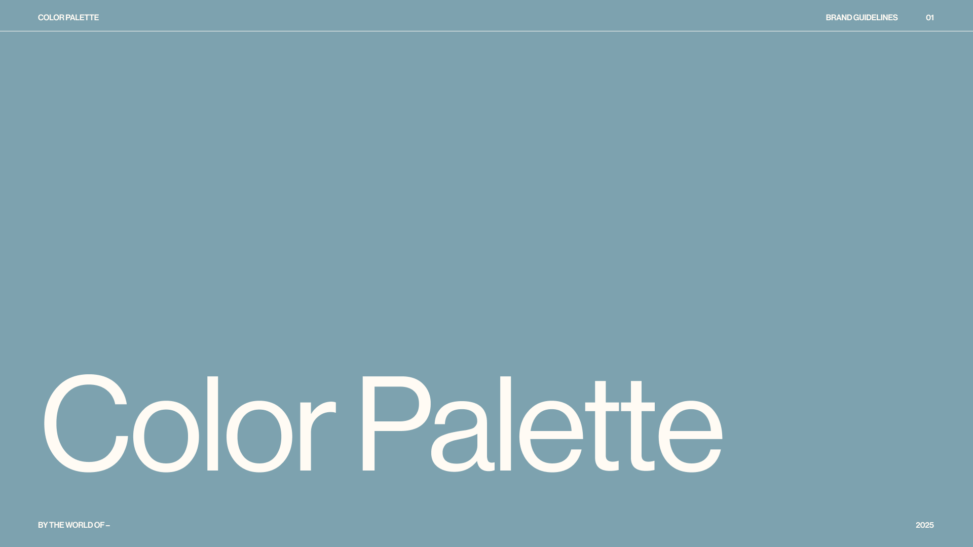
02 Color palette
Shades of Summer
Freda’s palette is inspired by the rhythm of the ocean, the warmth of summer, and the glow of days spent by the beach. Soft blush tones echo seashells and sunlit sand, while golden ochres and warm terracottas capture the late afternoon light. Deep greens and blues bring in the grounding presence of water and horizon, balanced by earthy browns and muted neutrals. Together, the colors feel sun-warmed and lived-in—inviting a sense of ease, texture, and glow into the brand.

Typography
Freda’s primary typeface, Neue Haas Grotesk, grounds the brand with clarity and modern simplicity. Its clean, versatile forms make it ideal for everyday use across digital and print applications, ensuring the brand feels approachable and consistent.
As a counterpoint, IvyOra is used as an accent font—bringing in elegance, softness, and a more editorial tone when needed. This pairing allows Freda’s typography to shift between functional communication and expressive storytelling, balancing the brand’s strategic and human sides.


Social Media Templates
Freda’s social media system was designed to feel playful, flexible, and instantly recognizable. The templates combine bold typography, layered textures, and a mix of soft neutrals with vibrant pops of color—mirroring the brand’s balance of ease and glow.
Each template is built to highlight different types of content, from product spotlights and ingredient features to founder’s notes and playful moments. Grid elements, stickers, and collage-inspired overlays add character while keeping everything cohesive. The result is a toolkit that makes content creation simple while ensuring Freda’s voice and visual identity stay consistent across every post.